
 blog
- Published by: Tutor City
- November 06, 2026
- Education
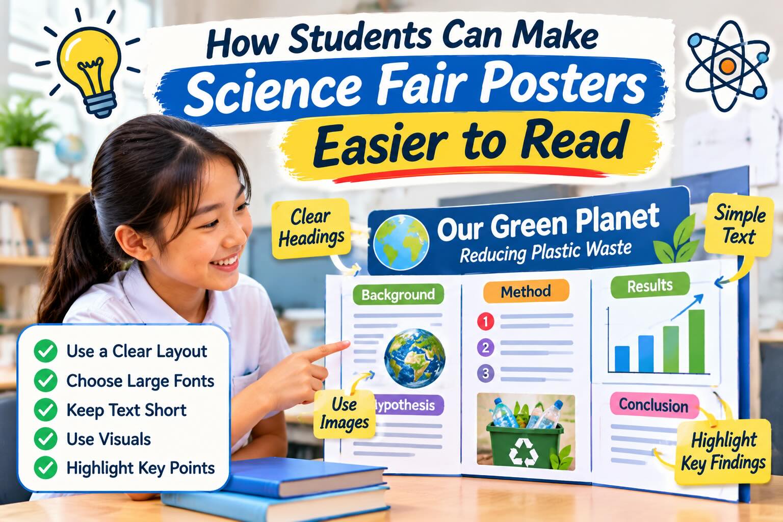
How Students Can Make Science Fair Posters Easier to Read
A science fair poster should make one thing clear straight away: there’s an event worth attending. Whether it appears on a classroom door or in a public place in town, people need to spot the invitation and find the details without stopping for a long read.
A crowded layout or tiny lettering can make even a simple announcement difficult to follow. Things like clear wording, readable text, and sensible spacing help the poster catch attention while making the date, time, and location easy to find.
The design can still be colorful and fun without becoming busy. A few well-chosen details can suggest the excitement of the fair while leaving plenty of room for essential information.
Before adding another decoration or line of text, consider whether it helps someone understand the event or simply gives them more to look at.
Plan a Clear Reading Path
Decide what crucial information needs to be included on the poster and what people should read first, second, and third before adding anything else to your poster. A clear reading path helps people understand information clearly and quickly.
So, yes, your poster should have an obvious, logical reading order. But it also needs consistent heading placement. Keep headings brief, but not so vague that they lose their meaning.
Also, leave visible gaps so that the poster is not overloaded and confusing.
Choose Formats That Keep Graphics Clear
Check your graphics before you spend time arranging them. An image that looks sharp on a laptop may appear blurry when enlarged for a poster.
Keep editable originals whenever possible. Vector graphics can scale without the pixelation that affects enlarged raster images, making them useful for clean lines and text.
If artwork is saved in a PDF, you can create vector files from PDFs using a free online converter. You can then scale without quality loss.
Make Your Text Comfortable to Read
Choose lettering that visitors can read easily. And keep the style consistent.
Set a Clear Size Hierarchy
Make the event title largest, section headings smaller, and body text smaller still. It is best to use at least 24-point text and captions for a poster format. Treat that as a starting point, then check your actual printout because board size and viewing distance matter.
Keep Font Choices Simple
Use one easy-to-read font for body text and, if needed, a second for headings. Avoid script lettering, narrow decorative fonts, and long passages written entirely in capitals. Save centered text for short elements, such as the main title.
Use Color and Spacing With a Purpose
Pick a small, consistent color palette rather than giving every section a different theme. Dark text on a light background is a straightforward starting point for body text.
Use color to connect related information. Add words, symbols, or patterns as well, so color is not the only clue distinguishing groups.
Check whether your headings, graphics, and spacing work together. Also, keep margins around text boxes and avoid placing lettering over busy photographs. Decorations should never make information harder to read.
Keep Logos and Sponsor Names Secondary
School logos and sponsor names can show who is behind the fair, but they should not dominate the poster. Keep the event title and practical details more prominent so readers notice the invitation first.
Place supporting logos together near the bottom rather than scattering them throughout the layout. Leave enough space between them to keep each one recognizable without creating a crowded strip.
If several organizations need credit, check whether plain text acknowledgments are acceptable instead of adding every logo. Follow any supplied branding requirements, while keeping these credits separate from the date, time, location, and other essential event information.
Design for the Display Location
Decide where the poster will appear before finalizing its design. A noticeboard, classroom door, and busy hallway each give people a different opportunity to stop and read.
For places where people are likely to walk past, make the event name and essential details readable at a glance. Keep those elements together so someone can quickly find out when and where the fair takes place.
Check the space available rather than assuming a larger poster will always work better. An oversized design may need to be reduced to fit a noticeboard, leaving text much smaller than intended.
Consider what will surround the poster, too. On a crowded board, a simple layout with a clear border of empty space can help separate the fair announcement from neighboring notices.
Print a draft and hold it in the intended position before producing the final copies. Check for glare, shadows, or nearby objects that could obscure important information.
If the poster includes a QR code, place it where people can comfortably reach it with a phone. Test it in position so visitors can access the event information without struggling to scan it.
Test the Poster Before Fair Day
Review the poster at its intended size, not just while zoomed in on your screen. Stand back several feet and check whether the event title, date, time, and location remain easy to spot.
Ask someone else to read it. Feedback can be invaluable. Notice where they hesitate or look in the wrong place.
Those moments show you where to shorten text, enlarge labels, or move information.
Making Your Science Fair Poster Ready for Visitors
A science fair poster does not need to be complicated to do its job well. A clear event title, readable lettering, and easy-to-find details give people what they need to plan a visit. Color and decoration can add personality, provided they do not compete with the message.
Before printing the final copies, check the date, time, and location, then view the poster from a few steps away.
And ask someone unfamiliar with the fair to give it a quick look and explain what they noticed. If an important detail gets missed, adjust its size or position rather than adding more explanation.
Has this article been helpful? If so, take a moment to check out some of our other insightful posts!






Tutor City's blog focuses on balancing informative and relevant content, never at the expense of providing an enriching read.
We want our readers to expand their horizons by learning more and find meaning to what they learn.
Resident author - Mr Wee Ben Sen, has a wealth of experience in crafting articles to provide valuable insights in the field of private education.
Ben Sen has also been running Tutor City, a leading home tuition agency in Singapore since 2010.
